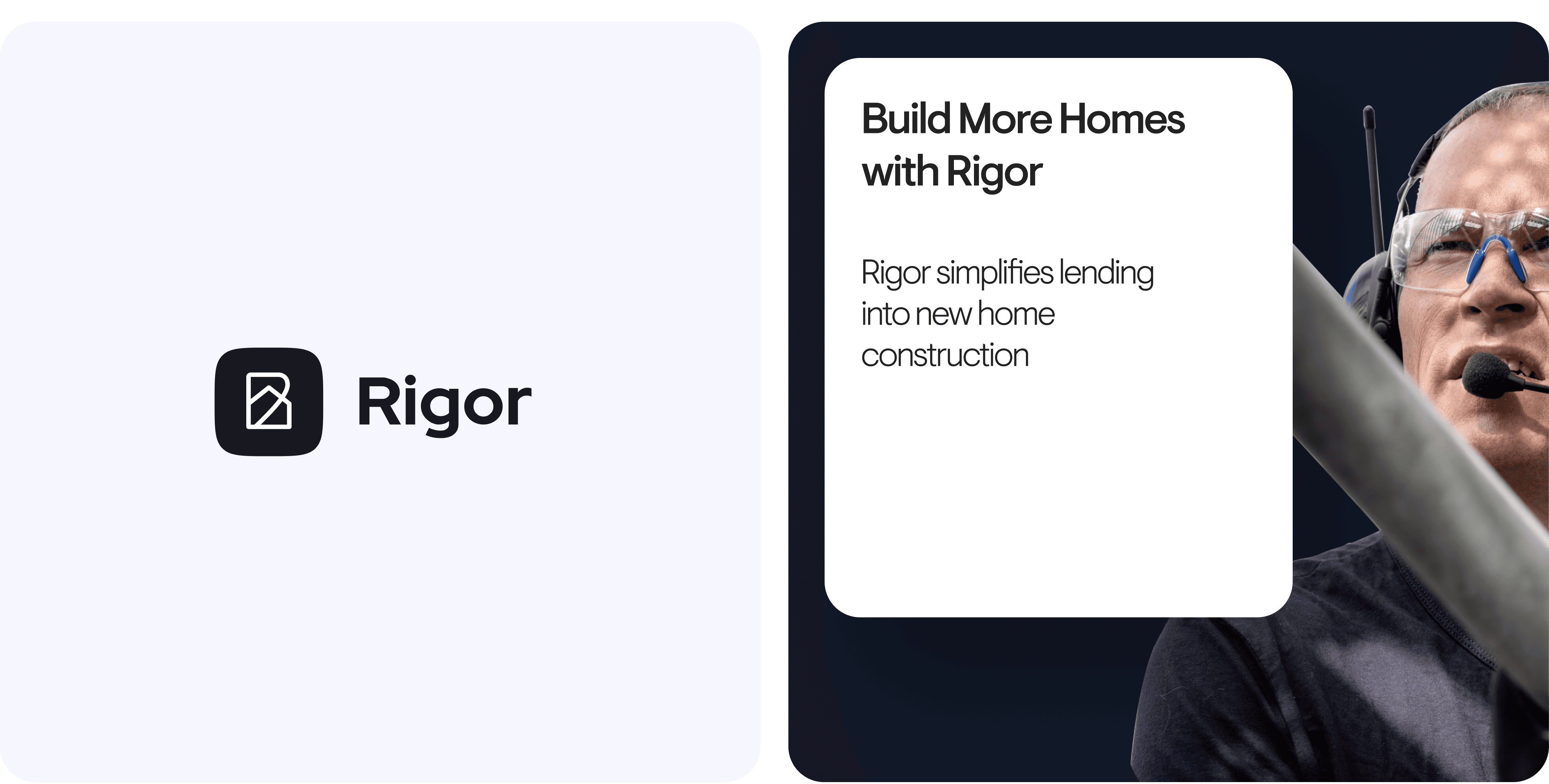
Redesigning construction finance. From clunky workflows to clarity.
What we did
Branding
UX/UI Design
Website Design
Product Management
Year completed
2022
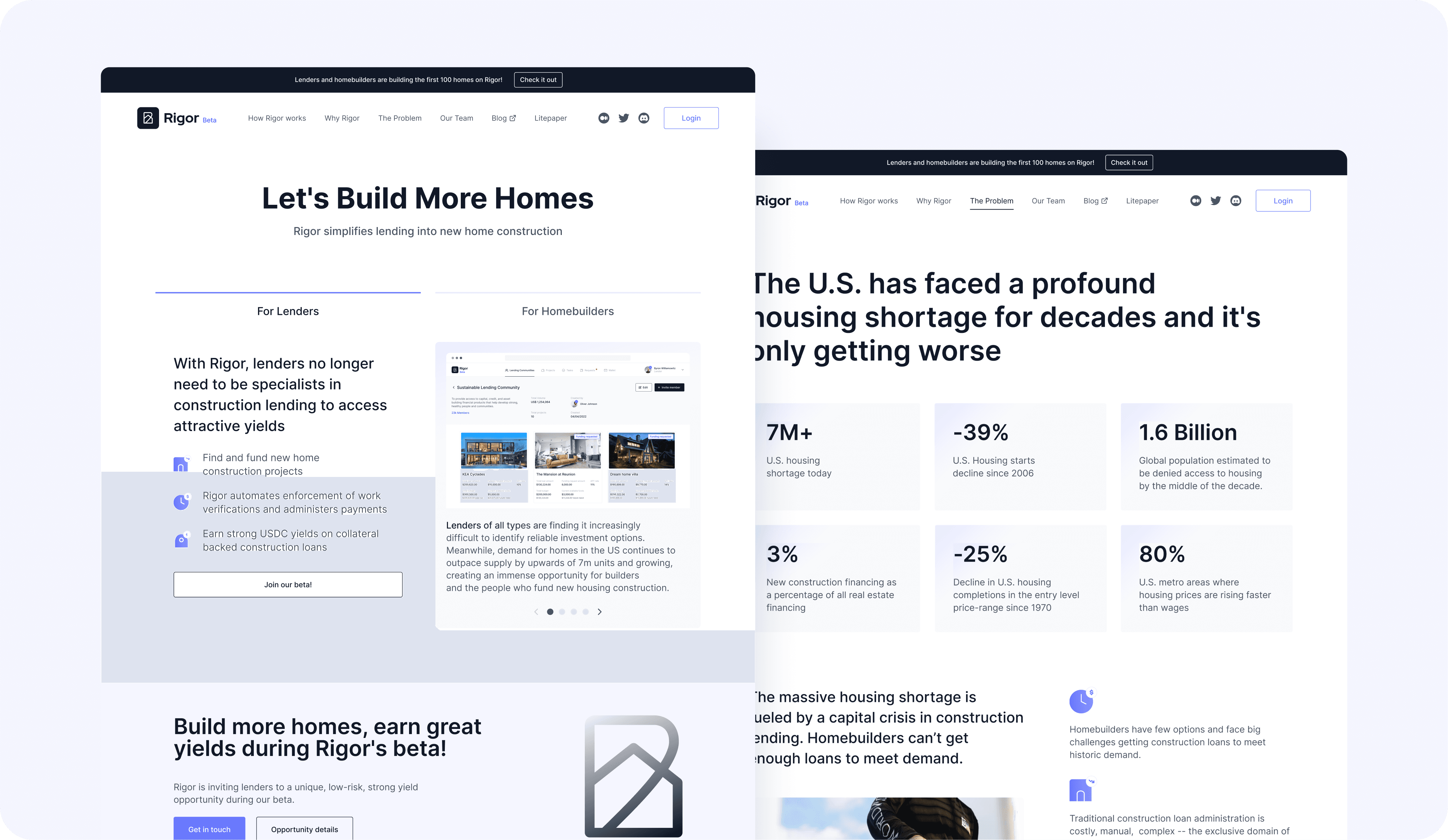
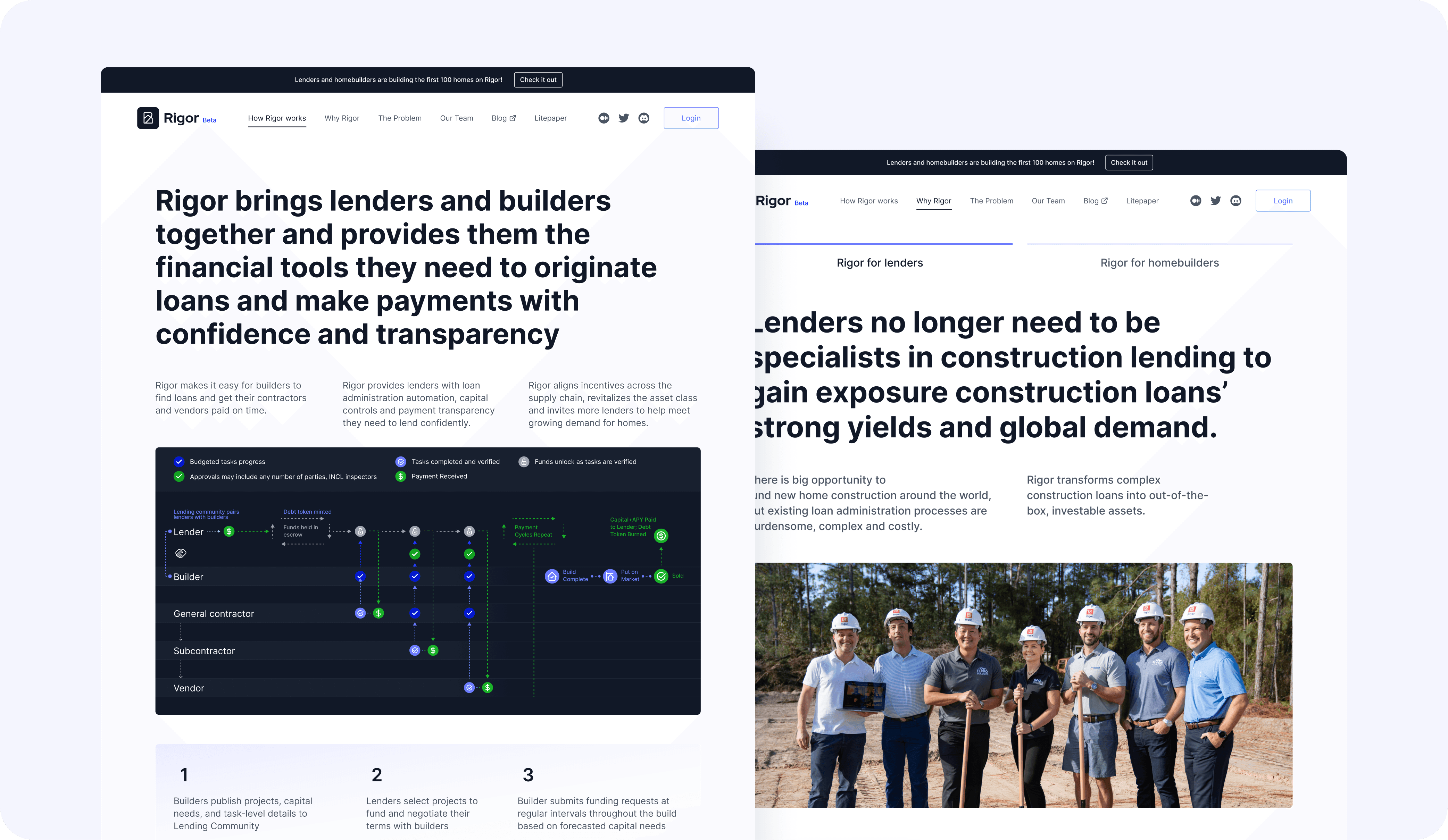
Rigor is a lending and payments platform for new home construction—connecting lenders, builders, contractors, and vendors in one place. The product had been live for two years, but the interface felt fragmented. Users were getting lost in complex workflows, and the brand didn't reflect how ambitious the product actually was. We came in to redesign the app and website, tightening up the UX and giving the brand a sharper, more cohesive identity.
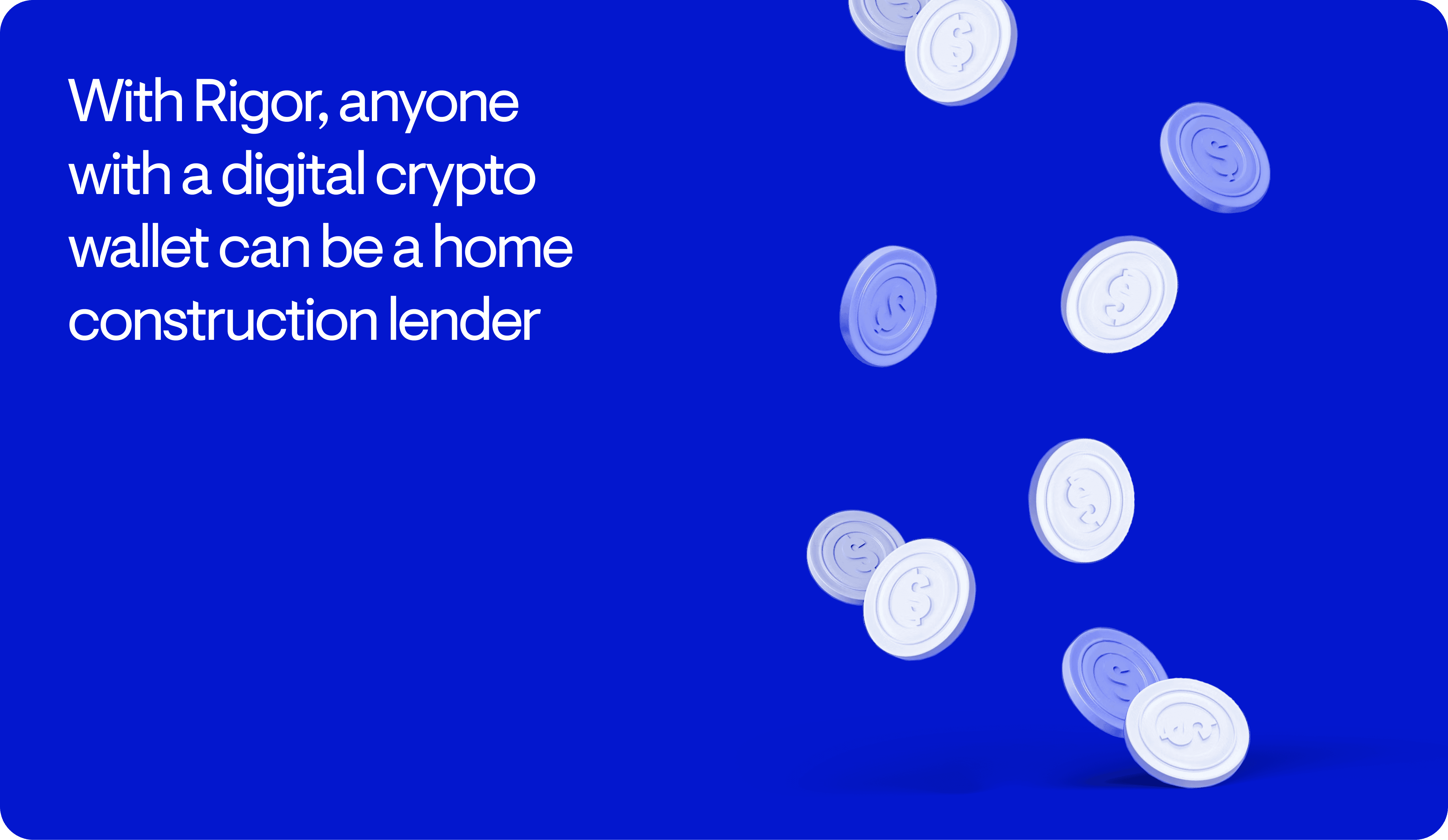
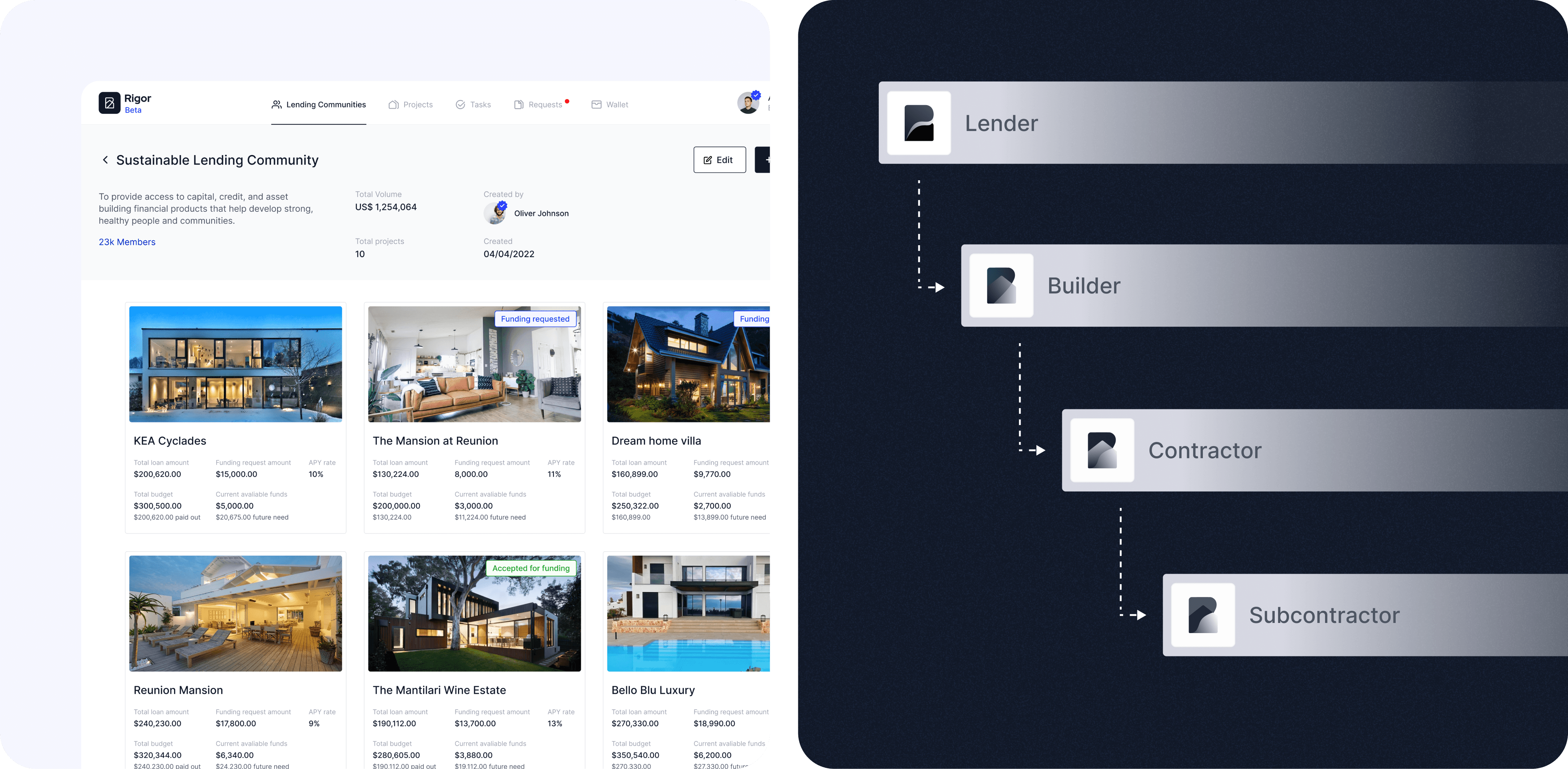
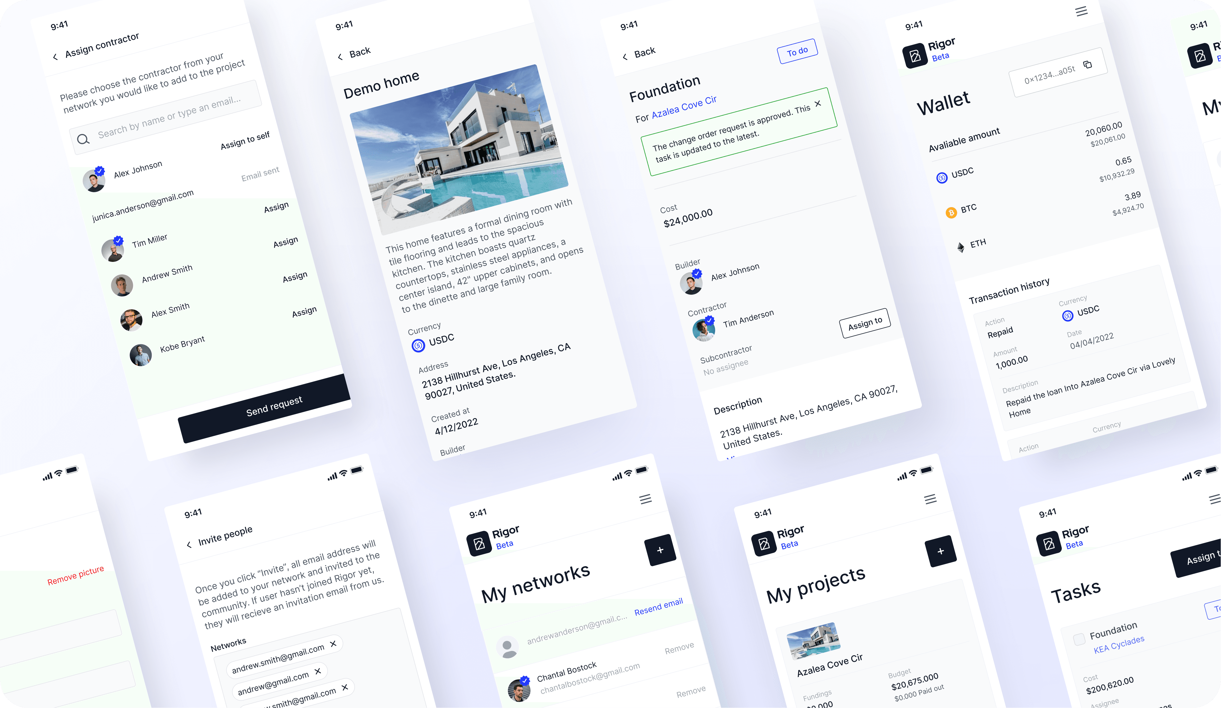
We started by mapping out the core user groups—lenders, homebuilders, contractors, subcontractors, vendors—and designing flows that made sense for each. Lenders needed a clear path from KYC to funding opportunities. Builders needed to submit proposals and track financing without jumping between tools. We built a modular design system that could stretch across all these use cases, keeping the UI clean and the hierarchy obvious. For the website, we ditched the dense explainer copy and let the product speak for itself—short, direct messaging with room for the platform to breathe.
The result: a product that feels like one system instead of bolted-together pieces. Users spend less time figuring out how things work and more time actually working.