A person running through an underpass toward daylight with the text overlay "Your Ultimate Running Companion." Various running options are labeled around the runner: "Just Go," "Distance Goal," "Interval," "Time Goal," "Indoor" (with a treadmill icon), and "Outdoor" (with a trail icon), suggesting customizable run tracking features. The overall tone suggests motivation and technology-enhanced fitness.
Logo featuring two upward-pointing arrows on a purple background, symbolizing growth or progression.

Birdie

Birdie

Designing a cash gifting app that makes money feel like a gift, not an apology.

What we did

UX/UI Design
Product Management

Year completed

2021

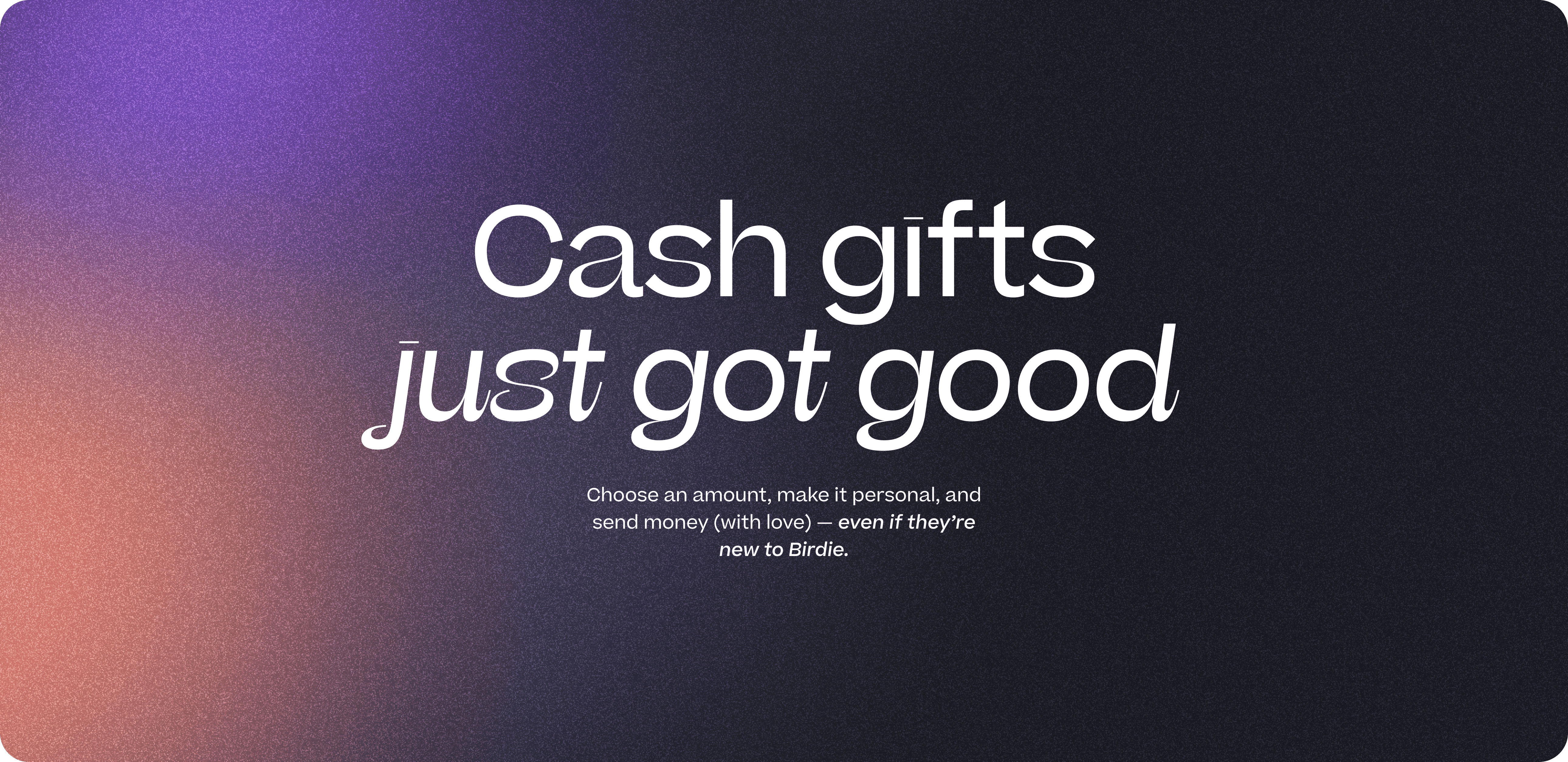
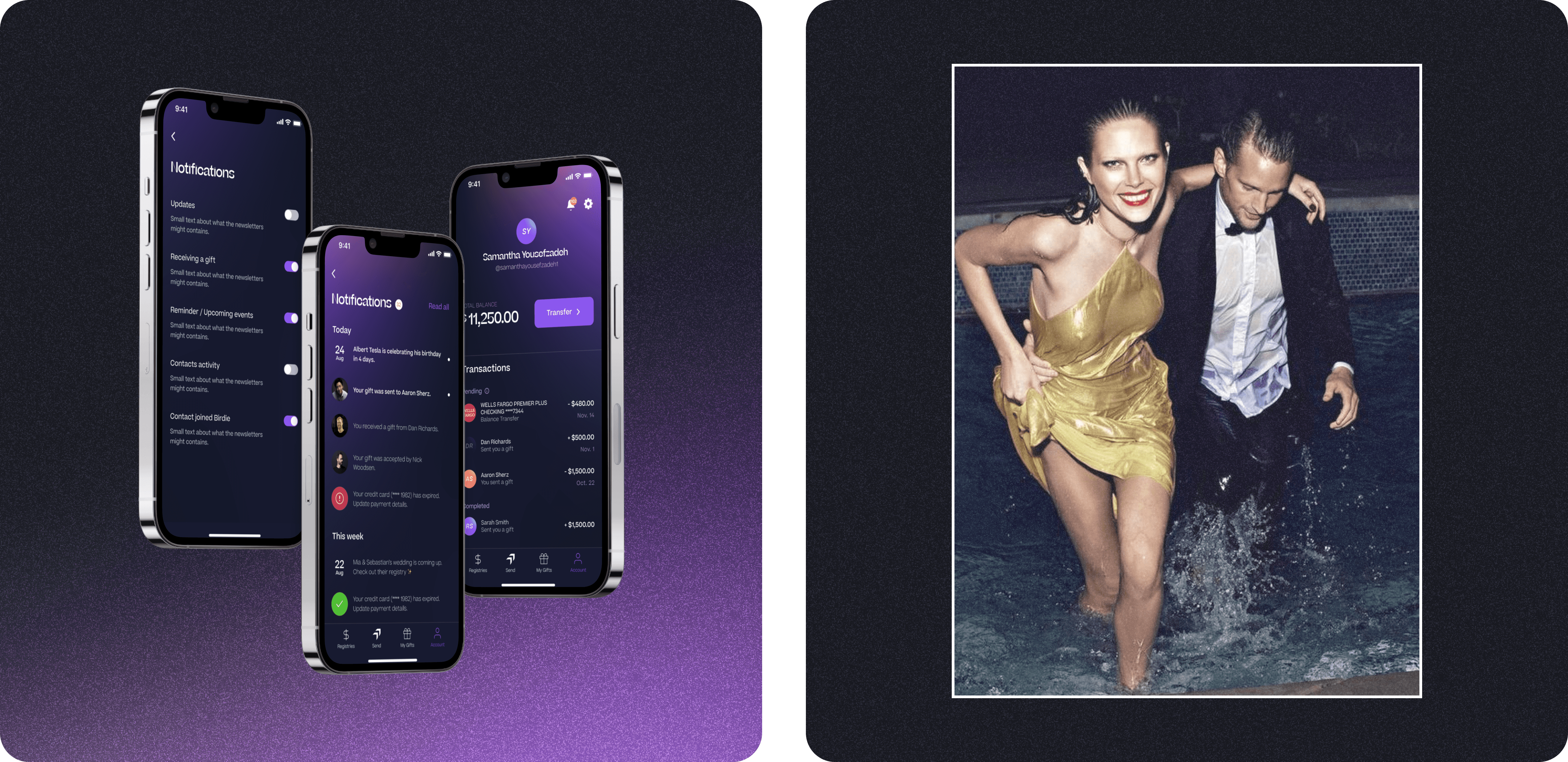
Birdie makes it easy to send cash as a gift — styled, wrapped, and celebratory. We came in when they were still in beta with a rough web interface and no mobile presence. The ask: build out the full product experience and create a mobile app that turned an awkward transaction into something people would actually want to use.

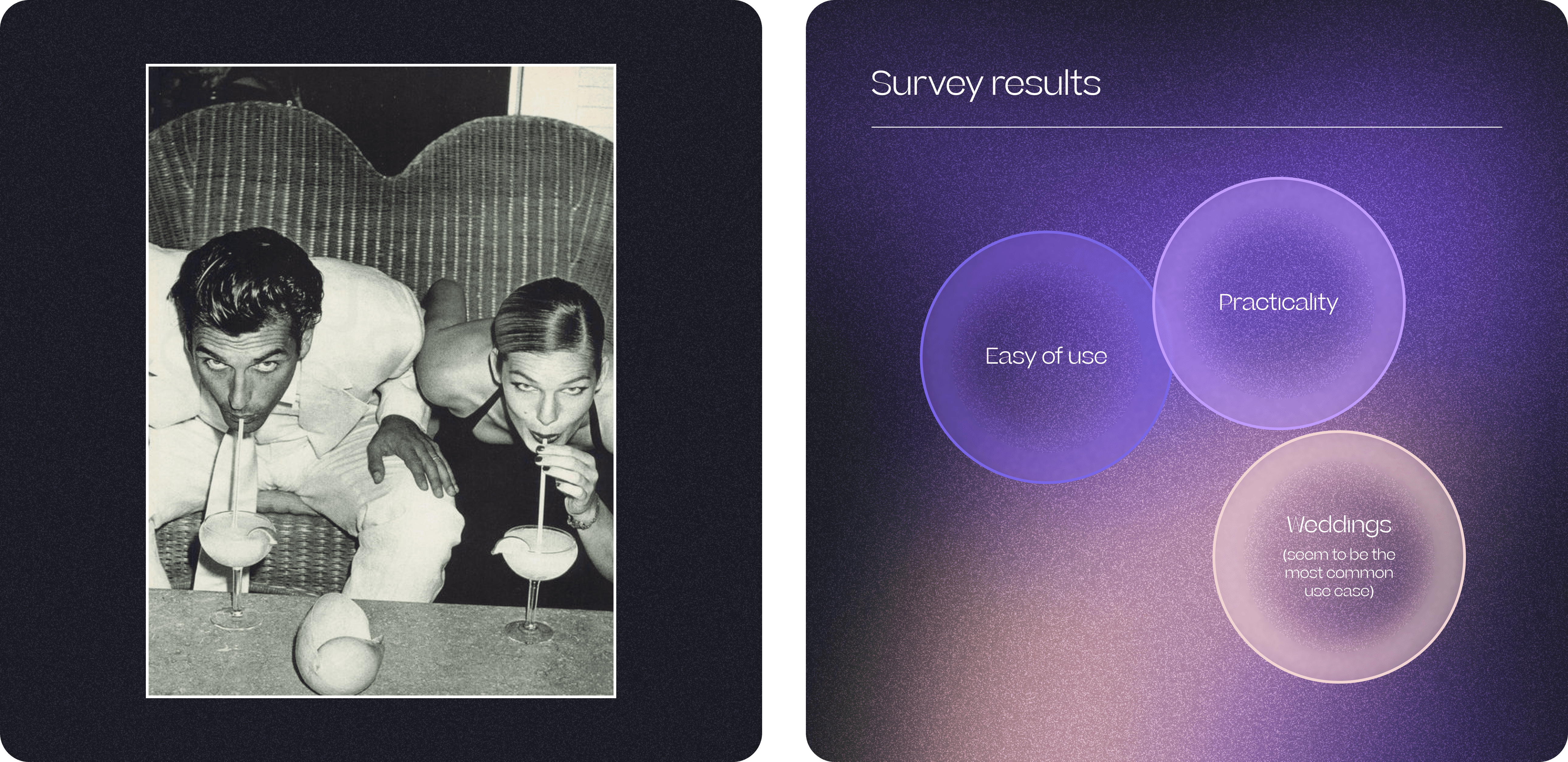
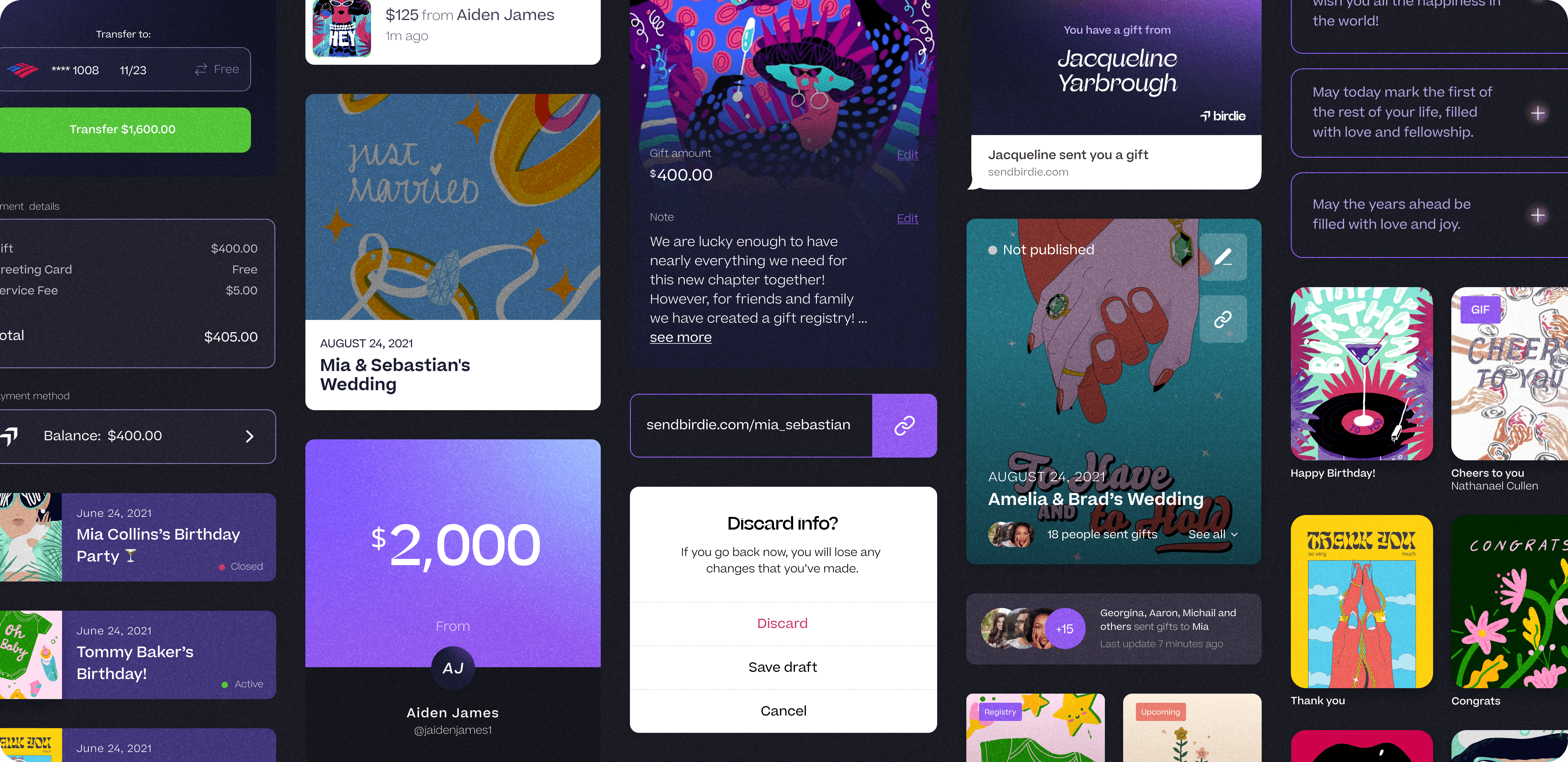
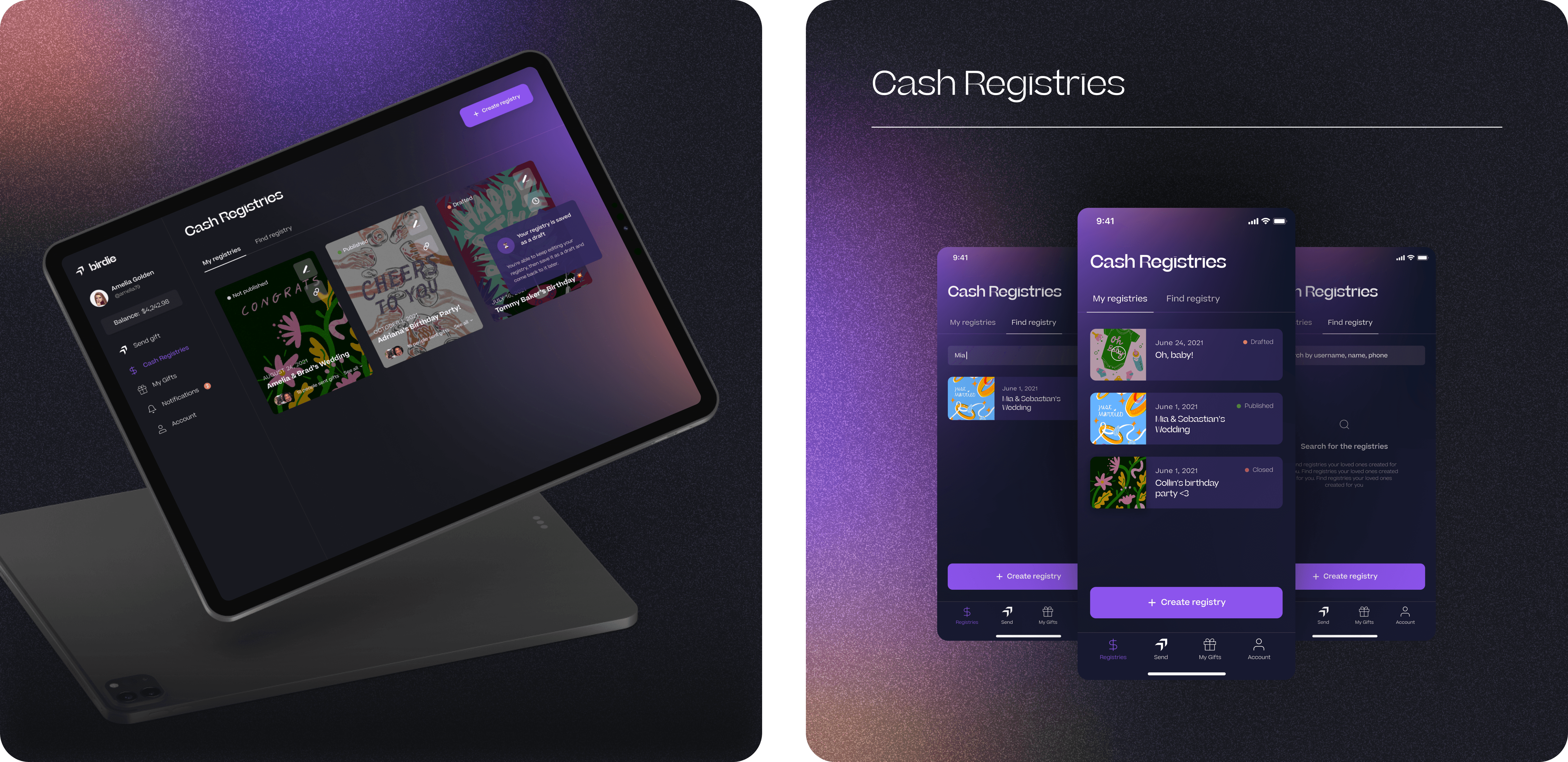
We started with research — talked to users, ran surveys, figured out why people avoid cash gifts even when they're the right choice. The insight: it's not about the money, it's about the presentation. So we built the experience around that. The app syncs with your contacts, walks you through sending cash in three clean steps, and wraps it all in cards that feel thoughtful, not transactional. We designed a night-sky palette — deep blues, warm pinks, sunset glow — to capture that pre-party anticipation. For features like cash registries, we kept the UI simple and direct: no friction, no guilt.

The result: an app that makes sending money feel intentional. Birdie turned cash from a fallback into an actual gift.

Abstract design featuring gradient colors with the text "sendbirdie" prominently displayed.
A split image: left shows two people interacting, right features three overlapping circles on a purple background.
Text on a gradient background: "Cash gifts just got good."
A collage of colorful app interfaces displaying various social media posts and content in a grid layout.
A digital display featuring colorful artwork, with playful designs and text highlighting various creative projects.
A split-screen image featuring a tablet and a digital interface on a dark background with purple accents.
A split image: on the left, abstract shapes in vibrant colors; on the right, a couple posing elegantly.

Huge thanks to the visionary team — Candace, Andrew, and Alex — for being such keen, kind and considerate collaborators. Continue your journey of making the magic of celebration! Also, hat’s off with utmost respect to Lovework Studio for a remarkable branding. It was such a pleasure to craft a product with the visual identity you created. Many thanks to Jessica Frascht, Lauren Hakmiller, Macey Howard, Ariadna Sys, prettycoolstrangers, and Shirley Mino — the artists from all around the world who created unique digital greetings for the Birdie app. Great job, Yasemin Ibrahimagaoglu and Darina Khomenko — you’re the true rock stars of our design team! And Rosty Volchak, thank you for being our communication wizard.

Subscribe to RDT Newsletter

So rare, it’s not yet in existence.

You could be the first to read... well, something, eventually.

© 2026 Rasa Design Team

All rights reserved

Subscribe to RDT Newsletter

So rare, it’s not yet in existence.

You could be the first to read... well, something, eventually.

© 2026 Rasa Design Team

All rights reserved

Subscribe to RDT Newsletter

So rare, it’s not yet in existence.

You could be the first to read... well, something, eventually.

© 2026 Rasa Design Team

All rights reserved