Turning a half-built prototype into a documented design system built to keep growing.
What we did
Product Design
UX/UI Design
Design System
Handoff Documentation
Year completed
2025
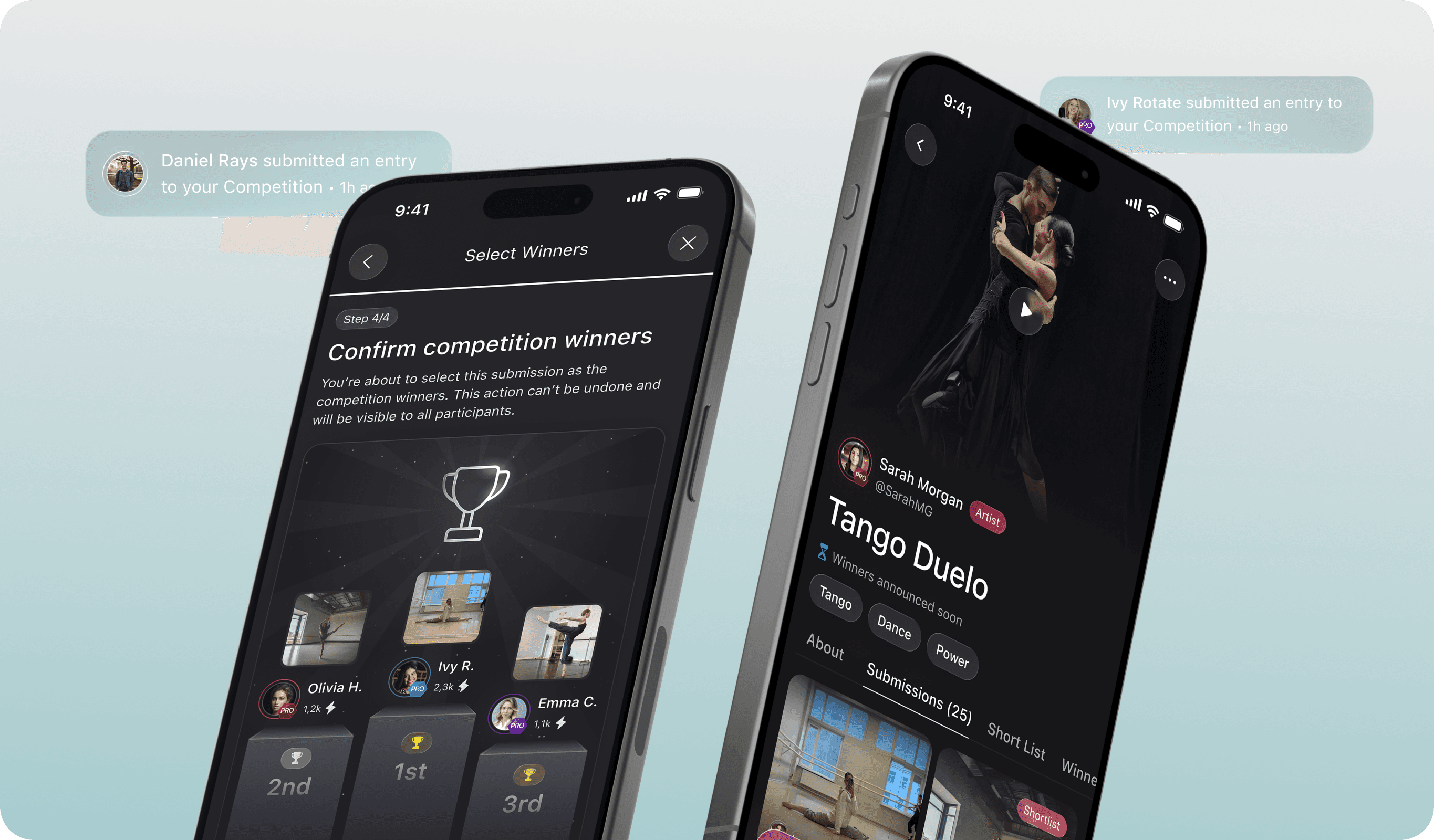
Qoria is a social platform for dancers — students take classes and enter competitions, teachers publish and monetize their content. When they came to us the app was half-built: developers had wired up a working prototype, two previous design teams had left partial Figma files, and none of the logic was documented. The branding existed too — five bright colors, none of them quiet — with one instruction attached: the interface shouldn't compete with what users post.
The dev budget ruled out rebuilding, so we worked inside the logic that already existed. First we mapped it — one visual document of the whole app, so we could see the structure instead of clicking through it. From there we designed every module — registration, feed, classes, feedback hub, competitions, messaging, profile, paid subscription — as one system with components that carried across.
The bright palette became functional rather than decorative. The UI stayed dark and restrained, and color did the signposting: blue gradients for learning, pink for competitions, a distinct accent for each of the four user roles. Competitions took the most iterations — 24-hour windows, re-opening submissions when entries ran short, randomized ordering so the loudest entries don't win by default.
We handed off the full product with a design system, per-screen developer notes, flow documentation, icon licenses, and animation guidelines. Not just a Figma file — everything the developers needed to build it, and to keep building after.